To cut down on shopping cart abandonment, you really need to nail three things: make your checkout dead simple, be upfront about all costs, and show customers they can trust you. Nearly 7 out of every 10 shoppers will walk away without buying anything, and these are the core reasons why. Fixing them turns those frustrating near-misses into actual sales.
The Real Impact of Abandoned Carts

Every single abandoned cart is more than just a lost sale. It's a missed connection with a customer who was literally moments away from clicking "buy." This isn't some minor hiccup—it’s a critical metric that hits your bottom line and screams that there's friction somewhere in your customer's journey.
Getting a clear view of this financial drain is the first step. Once you see the numbers, you can start turning this all-too-common problem into a massive opportunity for growth.
The stats paint a pretty stark picture. Globally, the average cart abandonment rate hovers around 70%, and that number skyrockets on mobile devices. This highlights a huge gap between what a customer wants to do and what they actually end up doing. To start fixing it, you first need to understand what's happening in your store. Digging into your data is non-negotiable, and our guide on https://apusnest.com/blog/understanding-ecommerce-analytics-unlocking-insights is a great place to start.
Key Drivers Behind Abandoned Sales
A few usual suspects are almost always behind why shoppers leave. These aren't just small annoyances; they are major roadblocks that stop a sale cold. To help you see where the biggest friction points lie, here’s a breakdown of the top reasons customers bail at checkout.
Top Reasons for Cart Abandonment and Their Impact
This table summarizes the most common issues that cause shoppers to abandon their carts, based on industry-wide data. Recognizing these patterns is the first step to building a checkout experience that converts.
| Reason | Percentage of Shoppers Affected | Potential Solution |
|---|---|---|
| Unexpected Costs | 48% | Display shipping, taxes, and fees upfront on the product page. |
| Forced Account Creation | 24% | Offer a prominent guest checkout option. |
| Complex Checkout | 21% | Simplify the form to only essential fields; use a progress bar. |
| Security Concerns | 17% | Add trust badges (SSL, payment logos) and a clear privacy policy. |
| Slow Delivery | 16% | Offer multiple shipping options, including expedited choices. |
As you can see, the problems are clear, and thankfully, so are the solutions. By tackling these issues head-on, you can dramatically improve your conversion rates and provide a much smoother experience for your customers.
Let's unpack these a bit more.
- Unexpected Costs: This is the big one. The top reason for abandonment is sticker shock at checkout. Nearly 48% of shoppers ditch their cart when they’re hit with surprise shipping fees, taxes, or other hidden charges.
- Complex Checkout Process: A long or confusing checkout is a guaranteed way to lose a sale. When people have to fill out endless forms or deal with a clunky interface, their patience evaporates fast.
- Forced Account Creation: Demanding that a customer create an account before they can buy is a massive point of friction. Most shoppers just want a quick, easy guest checkout, not another password to remember.
By focusing on these core issues, you create a smoother, more trustworthy experience that actually encourages shoppers to finish what they started. It’s all about removing barriers, not just adding more incentives.
Understanding these friction points is crucial. For instance, poor checkout design alone is blamed for an estimated $260 billion in lost sales every year. And mobile optimization? That’s another deal-breaker. With abandonment rates climbing to over 85% on smaller screens, a mobile-first design isn’t just nice to have—it's essential.
These stats really drive home the financial impact of a flawed checkout experience. As you can discover in more detail on clickpost.ai, identifying the specific reasons your customers are leaving allows you to roll out targeted solutions that bring those otherwise lost sales back.
Streamline Your Checkout Experience
A clunky, confusing checkout is the fastest way to lose a customer who was just moments away from buying. Think about it—every extra step, every unnecessary field, and every second of confusion adds friction that can stop a sale cold.
Making this final stage simpler isn't just a nice-to-have; it's one of the most direct ways you can cut down on cart abandonment and boost your store's performance. The goal is to make the journey from cart to confirmation feel completely effortless. You want to guide them down a clear, well-lit path, not make them navigate a maze.
Ditch Forced Account Creation
One of the biggest conversion killers I see is forcing users to create an account before they can check out. The data doesn't lie: 24% of shoppers will bail on their cart if they're required to sign up. People are short on time and are tired of creating yet another online account with a password they'll forget.
The solution is incredibly simple: offer a prominent guest checkout option.
This lets new customers fly through their purchase without any long-term commitment. You can always prompt them to create an account after the sale is complete, maybe on the order confirmation page. Frame it with benefits like easier order tracking or faster checkouts next time.
By making guest checkout the path of least resistance, you cater to the immediate needs of first-time buyers and significantly lower the barrier to purchase. The priority should always be securing the sale first.
Keep Your Forms Lean and Smart
Long, complicated forms are another major source of frustration. Every single field you ask a customer to fill out is another opportunity for them to get distracted or just give up. Your mission here is to slash your checkout form down to the absolute essentials needed to get the order out the door.
- Ask for essentials only: Do you really need their phone number? Or a separate billing address if it’s the same as the shipping one? Scrutinize every single field and be ruthless.
- Enable auto-fill: Use features that let browsers automatically populate fields like name, address, and even credit card info. This saves a ton of time and cuts down on typos.
- Use smart defaults: Go ahead and pre-check the "Billing address is the same as shipping" box. Small conveniences like this add up to a much smoother experience.
This screenshot shows how different e-commerce sites approach the initial customer information page.
Notice the difference in the number of fields and the layout's clarity? That directly impacts how fast a user can move to the next step.
Show Progress and Manage Expectations
An uncertain or seemingly endless checkout process creates anxiety. A visual progress indicator, often called a progress bar, is a simple but powerful tool that manages customer expectations. It shows them exactly where they are in the process and how many steps are left.
This small addition makes the whole thing feel finite and controlled, which encourages users to push through to that final confirmation screen.
For a deeper dive into how small user experience improvements can lift your sales, check out our guide on understanding conversion rate optimization. This is a core part of making your checkout not just functional, but highly effective at closing sales.
Build Trust by Eliminating Surprise Costs
Imagine your customer has found the perfect product. They’re excited, they’re ready to buy, and then…bam. Just as they pull out their credit card, the price jumps by 20%. That sticker shock is the single biggest sale-killer in e-commerce.
Nothing torpedoes a purchase faster than an unexpected cost. In fact, research shows a staggering 48% of shoppers will ditch their cart if they get hit with surprise shipping fees, taxes, or other hidden charges at the last second. This isn't just an annoying inconvenience; it's a breach of trust.
The antidote is radical transparency, right from the start. Instead of hiding the full cost until the final checkout screen, you need to show your cards early.
Be Upfront with All Costs
To sidestep those last-minute surprises, make the total cost impossible to miss throughout the entire shopping journey. This builds confidence and shows you respect your customer's budget.
- Add a Shipping Calculator: Integrate a shipping calculator right on the cart page. Let users pop in their zip code to see the costs before they even start the formal checkout process. No surprises.
- Estimate Taxes Clearly: Be direct. State that taxes will be calculated at checkout, or better yet, provide an estimate based on their location if you can.
- Display the "All-In" Price: If you have products with fixed shipping costs, consider showing the total delivered price right on the product page. This sets clear expectations from the moment they show interest.
When you take this approach, the total price feels familiar and fair by the time a shopper gets to the payment step. It’s no longer a bait-and-switch.
The Psychology of Shipping Fees
Shipping costs are a massive psychological hurdle. Most customers don’t see them as a necessary fee for a service; they see them as a painful surcharge that makes their great find feel a little less great.
This is why offering free or flat-rate shipping is one of the most powerful moves you can make to lower cart abandonment.
By making shipping predictable, you remove the biggest point of friction in the entire checkout process. A customer who knows the final price early is far more likely to complete their purchase.
Of course, "free" shipping is never truly free for you. The trick is to build a strategy that lets you absorb the cost without cratering your profit margins. Many stores set a minimum order threshold, like offering free shipping on orders over $50. Others bake a portion of the shipping cost into their product prices. Test what works for your business and your customers.
Display Trust Signals Loud and Clear
Beyond pricing, trust is built on reassurance. Shoppers are about to hand over sensitive financial information, and they need to feel completely secure doing it. Placing trust signals where they can't be missed can dramatically lower their anxiety.
Make sure these logos and links are visible throughout your checkout flow:
- Security Badges: Logos from well-known providers like Norton or McAfee.
- Payment Logos: Icons for Visa, Mastercard, PayPal, and any other payment methods you accept.
- A Clear Return Policy: Don’t make them hunt for it. Link directly to a straightforward, easy-to-read return policy.
When you’re transparent about costs and openly demonstrate security, you create a confident buying environment that helps guide shoppers smoothly from "Add to Cart" to "Purchase Complete."
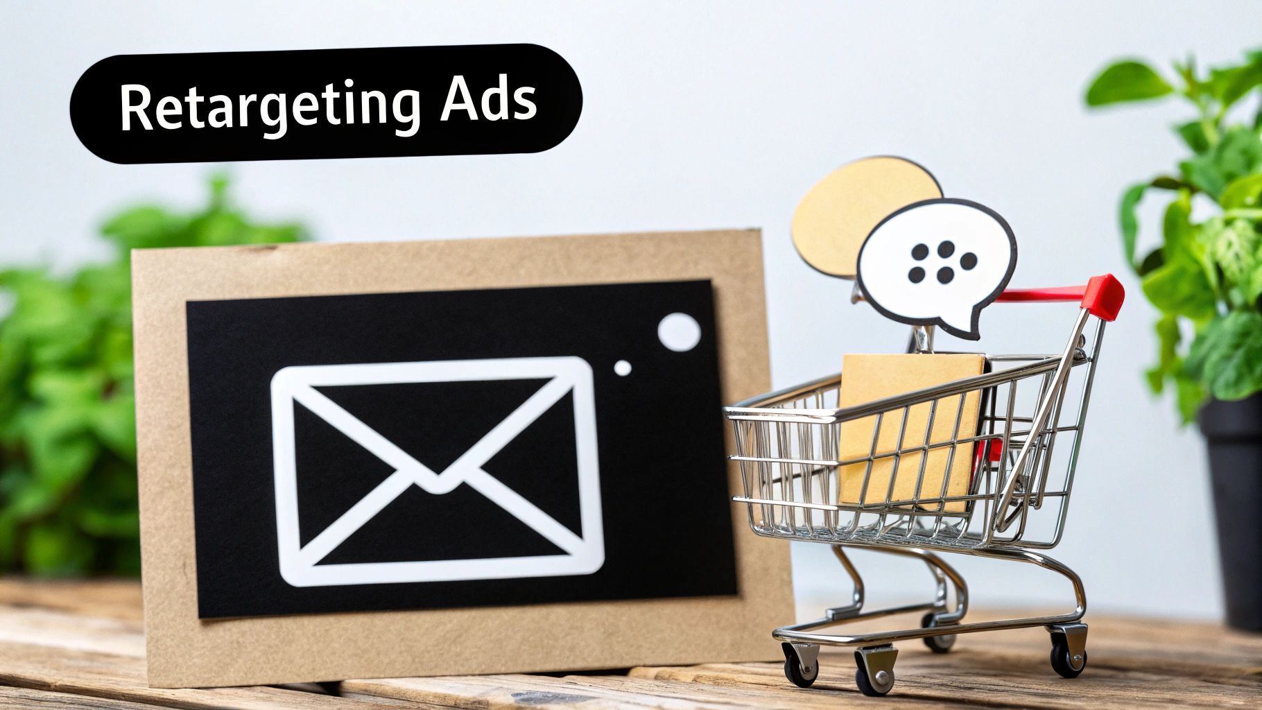
Win Back Customers with Smart Recovery Emails
An abandoned cart isn’t a lost cause—it's a warm lead. Think about it: a shopper who took the time to find products and start the checkout process is already highly interested. Your job is to re-engage them before that interest cools off.
Forget sending a single, generic "You left something behind" email and calling it a day. A thoughtful, automated recovery campaign is one of the most powerful tools you have for turning a near-miss into a sale. This isn’t just about sending reminders; it’s about starting a strategic conversation to bring a motivated buyer back across the finish line.
The Power of a Multi-Email Sequence
A multi-touch approach lets you tailor your message over time. Instead of putting all your eggs in one basket, you can build a gentle, persuasive follow-up that addresses different potential hesitations without ever feeling pushy. The data on this is crystal clear.
Studies consistently show that sending a series of three abandoned cart emails can generate far more revenue than a single-email campaign. This strategy taps into the massive $260 billion in recoverable lost orders that happen worldwide each year. You can dig into the latest cart abandonment recovery rates on analyzify.com to see just how critical timing and personalization are.
A well-timed recovery email feels less like an interruption and more like a helpful nudge. The customer has already shown you they're interested; you just need to make it as easy as possible for them to follow through.
Crafting Emails That Convert
So, what does a sequence that actually works look like? The goal is to be helpful, not just salesy. The best recovery emails are personal, visually appealing, and make it incredibly simple for the customer to pick up where they left off.
- Show, Don’t Just Tell: Always include high-quality images of the exact items left in their cart. That visual reminder is a powerful memory jogger.
- Use Their Name: A simple "Hey, [Customer Name]" feels a world away from a generic greeting. Personalization builds an immediate connection.
- Compelling Subject Lines: Ditch the boring "Your cart is waiting." Try something with more personality or urgency, like "Did you forget something?" or "Your items are selling out fast!"
Here's a great visual that breaks down how different incentives can reduce abandonment and get more people to complete their purchase.
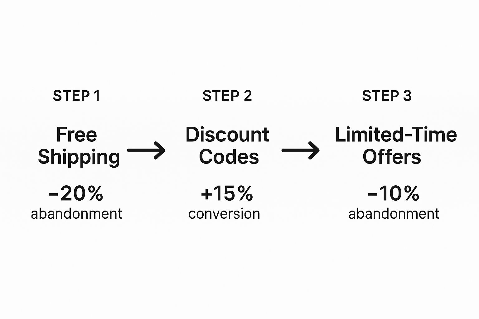
This flow really drives home how strategic offers like free shipping or a limited-time discount can directly influence a customer's decision. Your recovery emails are the perfect place to deliver these kinds of nudges.
To really get the most from your campaigns, you need to dig into the data. Knowing which subject lines, offers, and send times are working best is how you refine your approach. If you're ready to take a closer look, our guide on understanding data-driven campaign optimization is the perfect next step. That's where you turn good results into great ones.
Effective Cart Recovery Email Sequence
A multi-touch email campaign is designed to maximize recovery rates by gently reminding and incentivizing customers over a short period. Each email serves a distinct purpose, moving from a simple reminder to a more compelling offer.
| Email Timing | Content Focus | Call to Action |
|---|---|---|
| 1-3 Hours After Abandonment | A gentle, helpful reminder. Focus on the products left behind with high-quality images and a friendly tone. | "Return to Your Cart" or "Complete Your Order" |
| 24 Hours After Abandonment | Address potential hesitations. Mention customer support, FAQs, or positive reviews to build trust. | "Still Thinking It Over?" or "View Your Items" |
| 3-5 Days After Abandonment | Create a sense of urgency or offer a small incentive. This could be a limited-time discount or a "low stock" alert. | "Your 10% Off is Waiting" or "Don't Miss Out!" |
This structured approach respects the customer's journey while strategically guiding them back. By spacing out your messages and varying the content, you increase your chances of conversion without overwhelming their inbox.
Adapt Your Store for Global Shoppers
What works flawlessly for your local customers can be a major deal-breaker for shoppers on the other side of the world. It's a hard lesson many growing businesses learn. As you scale, adapting to regional expectations becomes one of the biggest factors in the fight to reduce cart abandonment. A one-size-fits-all checkout is a recipe for lost sales.
The geographical differences in checkout behavior tell a fascinating story. For instance, Asia records one of the highest global abandonment rates, hitting 84% in 2024. This is often driven by strong preferences for flexible delivery and sustainability. A 2023 survey found a staggering 92% of Indian shoppers abandoned carts over sustainability concerns. Meanwhile, 45% of Chinese shoppers prioritized flexible delivery options often missing from global platforms.
Europe's abandonment rate hovers around 80%, influenced by high shipping costs and limited payment choices. In regions like the Middle East and Africa, that number can even climb to 93%. You can get a deeper look at these regional consumer expectations and their impact on vwo.com.
Offer Local Payment Methods
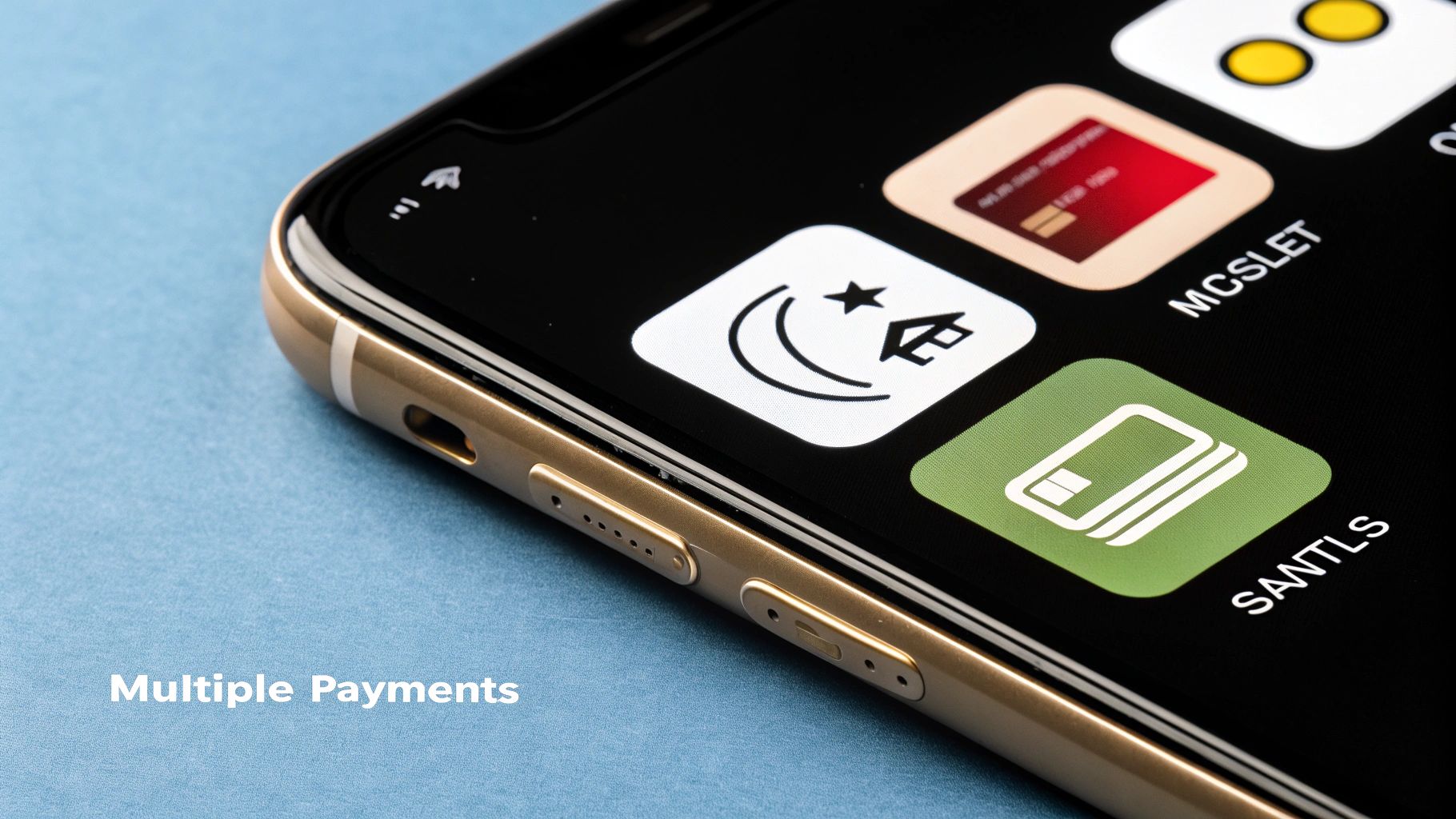
One of the most critical adjustments you can make is offering payment methods people actually use and trust. While credit cards are the standard in North America, they are far from universal.
Take the Netherlands, for example. Here, iDEAL is the dominant online payment system. If you're selling to Dutch customers without offering it, you're practically inviting them to leave. The same goes for offering Sofort in Germany or Alipay in China. These aren't just nice-to-haves; they're table stakes for conversion.
Failing to provide familiar and trusted payment options is like asking a customer to pay in a foreign currency they don't have. It creates an immediate barrier and erodes the trust needed to complete a purchase.
Tailor Shipping and Delivery Options
Shipping is another area where expectations vary dramatically by region. In some markets, next-day or even same-day delivery is the standard. In others, customers are more patient but expect lower costs or different delivery arrangements.
- Flexible Delivery: In many parts of Asia, options like leaving a parcel with a neighbor or at a local pickup point are highly valued.
- Transparent Timelines: For any international order, providing clear, realistic delivery timeframes is non-negotiable. Vague estimates create uncertainty and kill sales.
- Cost vs. Speed: Give customers a choice between affordable standard shipping and faster, more expensive express options. This lets them decide what matters most to them.
By doing your homework on the payment and delivery preferences of your target markets, you can remove major friction points from your checkout. This kind of localization shows international shoppers that you understand their needs, making them far more likely to click "buy." It's a must-do for any brand serious about succeeding on a global scale.
Frequently Asked Questions
Even with the best strategies in place, specific questions always pop up when you're trying to nail down cart abandonment. Let's tackle the most common ones store owners ask, so you can move forward with total confidence.
What Is a Good Cart Abandonment Rate?
Everyone wants a magic number, but the truth is, a "good" rate is a moving target. The global average sits around 70%, but this figure swings wildly depending on your industry. If you’re selling furniture, you'll naturally see more abandoned carts than a store selling socks.
Instead of getting hung up on a universal benchmark, focus on your own trend line. The real goal is to consistently chip away at your current rate, month after month. If you can get it below 60%, you’re already outperforming most e-commerce stores.
How Do I Know Why My Customers Are Leaving?
Analytics will show you what is happening, but they'll never tell you why. To get the real story, you have to do something simple: ask your customers.
The most direct way to do this is with feedback tools.
- Exit-Intent Surveys: A small pop-up that appears just as a visitor is about to leave the checkout page can ask one simple, powerful question: "What stopped you from completing your purchase today?"
- Post-Abandonment Emails: In your first recovery email, right alongside the link back to their cart, include a friendly line like, "Was there an issue with your checkout experience?"
This kind of direct feedback is gold. It cuts through the guesswork and points you straight to the friction, whether it’s a buggy form field or a missing payment option.
Understanding the 'why' behind the numbers is the key to making impactful changes. Direct customer feedback cuts through the guesswork and points you straight to the problem.
Should I Offer Discounts in Recovery Emails?
This is a big one. While a discount can be a great closer, throwing it out there too early is a classic mistake. If you lead with a discount in your very first recovery email, you’re basically training your customers to abandon their carts just to get a better deal.
A much smarter, more profitable approach is to use a tiered strategy.
- Email 1 (1-3 hours later): Start with a simple, helpful reminder. No offer, just a gentle nudge.
- Email 2 (24 hours later): Follow up again. This time, you might highlight a few product benefits or share a great customer review.
- Email 3 (3-5 days later): If they still haven't checked out, now is the time to bring out the incentive. A small, time-sensitive discount—like 10% off for the next 24 hours—can be the final push they need.
This method protects your margins by saving discounts for when they’re truly needed, rather than making them an automatic giveaway. By testing this flow, you can build a system that wins back sales without killing your profits.
Ready to turn your sales data into actionable insights? ApusNest analyzes customer buying patterns to reveal powerful cross-sell opportunities, helping you increase your average order value and optimize your store layout. Start making data-driven decisions today at https://apusnest.com.
Article created using Outrank